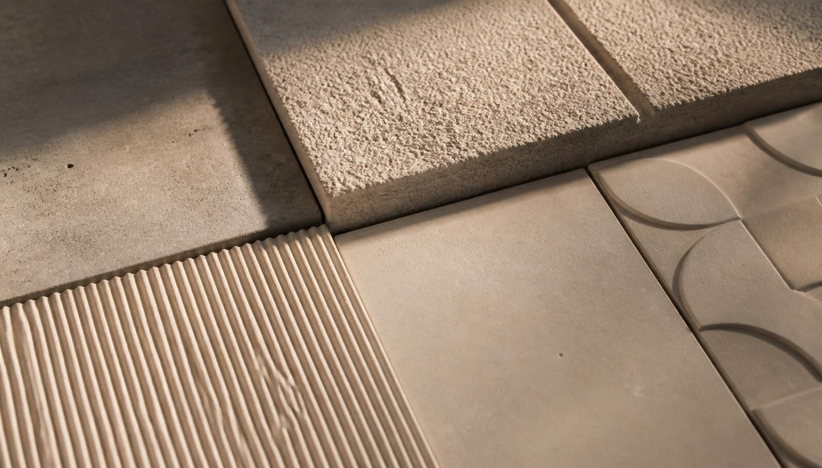
Surface & Light
Two walls can share the same colour reference and read as entirely different materials. The variable is finish — and finish is best understood as an instrument for controlling light.
Smooth: composure
A smooth surface reflects light evenly and recedes. It is the right choice when the architecture is the subject: a double-height volume, a stair, a long uninterrupted plane where the eye should travel rather than stop. In darker tones it becomes almost liquid; in pale tones it reads as a soft, matte field.
Sandblasted: grain
Sandblasting opens the surface and brings the aggregate forward. The result is a fine granularity that scatters light and makes tone appear warmer and slightly deeper than the same colour in a smooth finish. It is the most tactile of the finishes, and the most forgiving in high-traffic environments.
Relief: architecture in miniature
Geometric and relief surfaces — the language of collections such as Diagonal, Quilt and Grid — do not depend on colour at all. They depend on the angle of the light. A wall that appears calm under diffuse daylight can become emphatic when washed from above at night. Two lighting scenes, one surface, two rooms.
Specifying with intent
- Establish the light first. Decide where daylight enters and how the space will be lit after dark, then choose the finish that responds to it.
- Judge samples in position. Tone and texture read differently vertically and horizontally, and differently again at the scale of a wall.
- Let one surface lead. A relief plane earns its impact when the surfaces around it stay quiet.
- Consider the hand. In a hotel corridor or a private entrance, the surface will be touched. Texture is part of the welcome.
Finish is not a detail resolved late in the process. Chosen early, it becomes the most economical way to give a space character.
