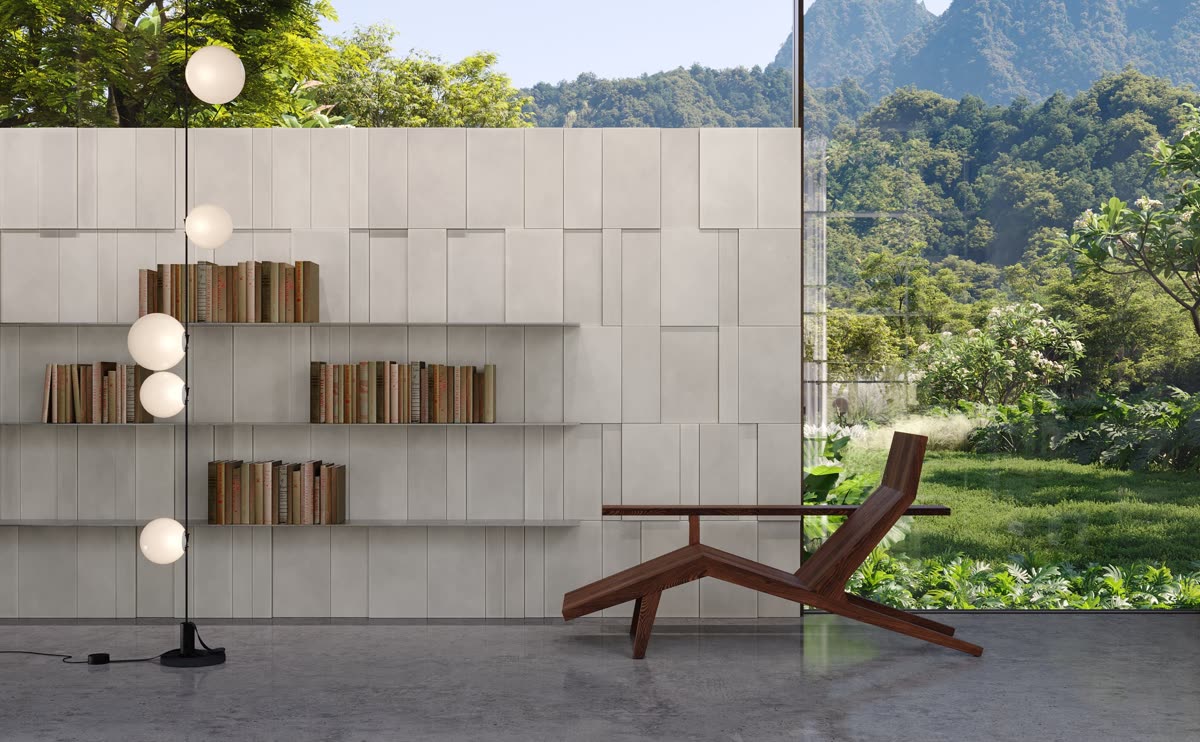
September 26'
A sophisticated surface does not have to look perfectly uniform.
In fact, uniformity can sometimes remove precisely what makes a material interesting: evidence of how it was made, subtle variations in tone, changes in texture and the small irregularities that allow the eye to recognise matter rather than an image of matter.
Concrete makes this distinction particularly clear.
We tend to associate it with structure, mass and engineering. Yet once concrete is brought from the scale of construction to the scale of the hand, another character begins to emerge. Its porosity becomes visible. Small tonal differences appear. Texture catches the fingertips as well as the eye. Light moves differently across one area than another.
The material becomes less anonymous.
For RO, this is where concrete begins to become an architectural surface.
Discover RO handmade concrete →
Perfection is not the only route to sophistication
Much of contemporary manufacturing has been built around consistency.
There are good reasons for this. Precision makes materials predictable and repetition makes surfaces easier to control. But architectural interiors are not composed only through precision. They are also experienced through material character.
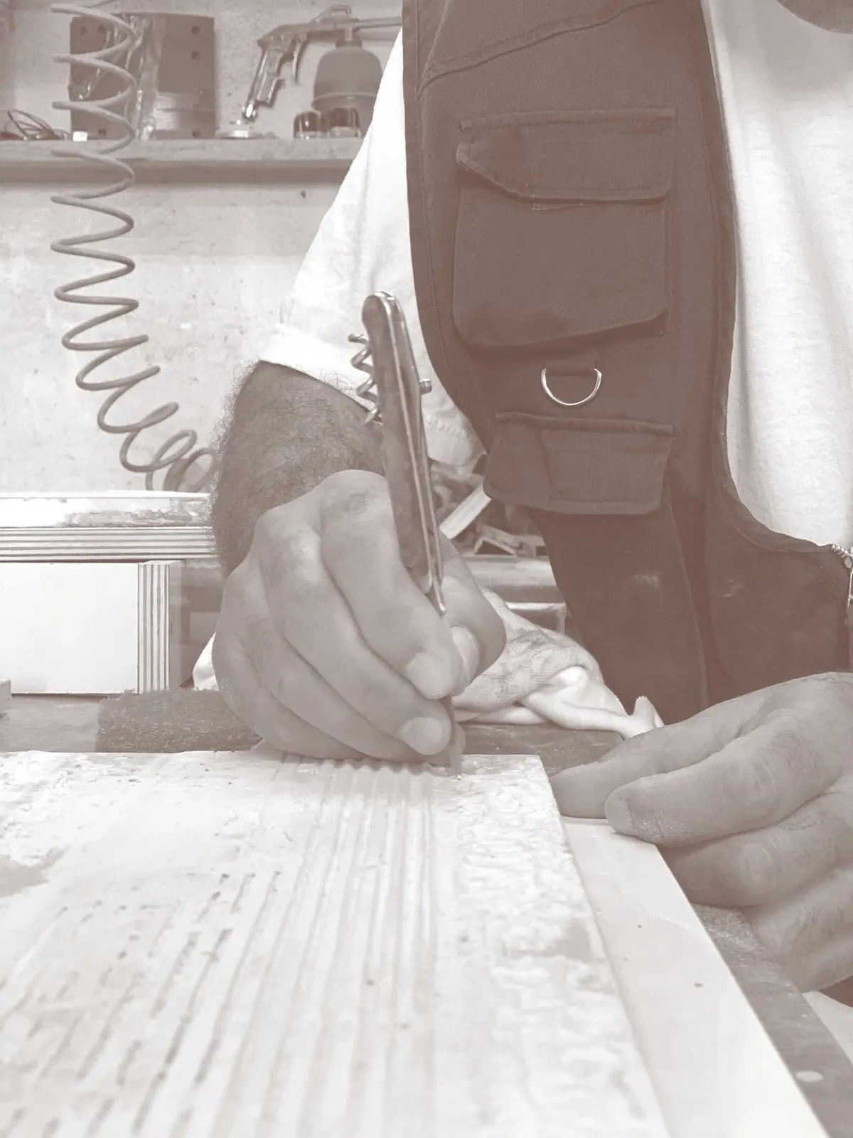
A wall of handmade concrete has a different visual presence from a completely uniform plane because the material retains traces of its own making.
RO’s technical documentation describes natural variations in shade, texture and dimension as characteristics of its handcrafted production rather than anomalies to be hidden.
Learn more about the natural characteristics of RO handmade concrete — Technical Information →
This distinction matters.
If variation is treated simply as a manufacturing defect, the goal becomes to eliminate it. If it is understood as part of the material language, the designer can begin to work with it.
The surface acquires individuality without relying on applied decoration.
That is a different idea of sophistication: one based less on flawless repetition and more on material authenticity.
Wabi-sabi as a way of reading material
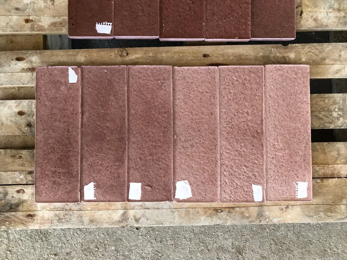
RO draws part of its philosophy from the Japanese aesthetic idea of wabi-sabi and its acceptance of natural imperfection. The brand’s own story connects this principle with the unpredictability of concrete and the decision to work with the material rather than suppress its character.
For architecture, the useful part of this idea is quite practical.
It gives us another way to read a surface.
A slight tonal difference does not necessarily need to disappear. A subtle mark does not automatically need to be corrected. Variation can create richness precisely because it prevents a large surface from becoming visually mechanical.
This does not mean celebrating randomness for its own sake.
The value comes from the balance between design intention and the characteristics of the material.
Geometry can be controlled. Composition can be controlled. Rhythm can be designed. But within that framework, handmade concrete retains a degree of natural variation.
The result is neither accidental nor perfectly identical.
It exists somewhere between the two.
From concrete to surface
The architectural potential of concrete changes when attention shifts from the material itself to its surface.
Relief introduces another dimension.
A flat wall primarily defines a boundary. A textured wall can do more. It can catch light, produce shadow, create direction and establish a rhythm across a larger architectural plane.
This changes how the eye reads the wall.
Rather than perceiving it only as background, we begin to notice intervals, transitions and changes in depth. The surface participates in the spatial composition.
RO has explored this territory through variations in shape, direction, layering, pattern and texture, using concrete as a medium for three-dimensional expression.
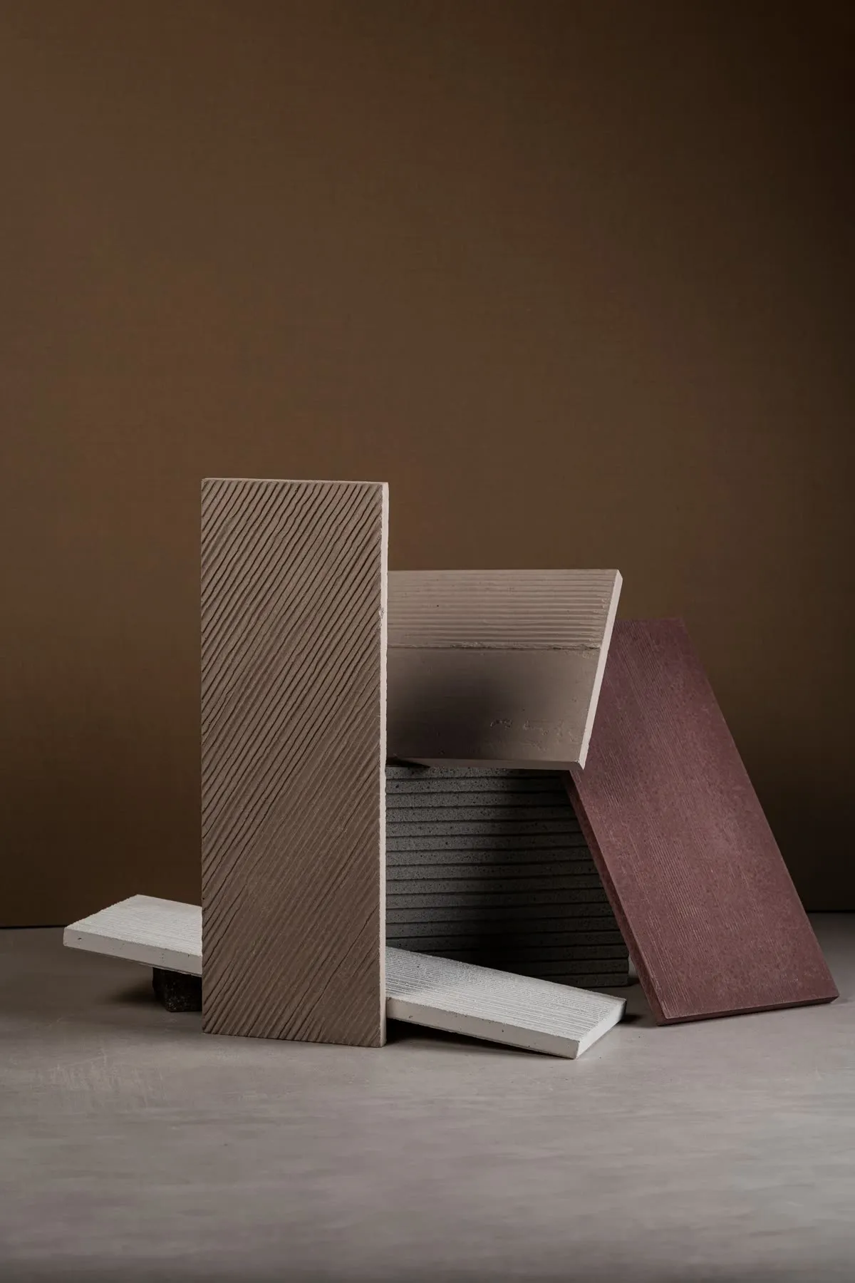
That shift is fundamental.
The question is no longer simply which material should cover this wall. It becomes: what should this wall contribute to the architecture?
Should it create movement?
Should it slow the eye?
Should it reinforce a horizontal proportion?
Should it bring tactility into an otherwise precise interior?
Should it remain quiet until the light reveals it?
Those are architectural questions rather than decorative ones.
Explore RO surfaces and textures — Collections →
Light reveals what the material contains
Texture cannot be considered independently from light.
A relief that appears subtle under diffuse illumination may become much more graphic under lateral light. A surface illuminated from close range can reveal small differences in depth that almost disappear under uniform ambient lighting.
For this reason, RO’s technical guidance recommends considering lighting during the design phase rather than after the surface has already been specified. Different light directions can emphasise horizontal or vertical textures, while grazing light can accentuate relief and three-dimensionality.
Explore RO’s guide: The Importance of Lighting →
The important point is not that there is one correct lighting solution.
Light becomes part of the material decision.
A three-dimensional concrete surface is not visually fixed. Its appearance evolves as natural light changes throughout the day and as artificial lighting conditions change in the evening.
The architecture therefore gains a subtle form of movement without anything physically moving.
Tactility changes perception
We often evaluate architectural materials visually, particularly during the early stages of a project.
But some materials become fully understandable only when they are seen at close range.
Concrete is one of them.
Its porosity, density and texture create a tactile reading even before the hand reaches the surface. The eye anticipates touch.
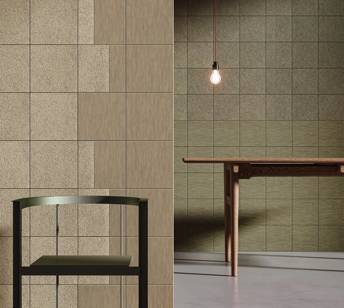
That perception can be particularly valuable in interiors dominated by smooth materials: glass, lacquered joinery, metal, polished stone or uniform plaster.
Introducing textured concrete can interrupt that visual smoothness without introducing ornament.
The contrast is material rather than decorative.
It can make a space feel warmer because the surface has greater visual depth. It can create a sense of permanence because the material does not attempt to disguise its substance. It can bring individuality because small variations prevent the wall from feeling mechanically reproduced.
None of these effects requires the surface to become the visual protagonist of the room.
Material presence can be quiet.
Designing with variation
For architects and interior designers, working with handmade concrete also requires a small shift in expectation.
A sample should not always be understood as an exact image of every future piece.
It is better understood as an expression of a material family.
Experience the material first-hand — Request a sample →
Natural variations in texture and tone mean that the completed surface gains character through accumulation: one piece beside another, small differences interacting across the wall.
RO’s documentation explicitly describes these variations as an element that gives its coverings authenticity and depth.
This is particularly important at architectural scale.
What may seem like a tiny difference when holding an individual element becomes part of a richer visual field when repeated across several square metres.
The wall becomes less like a printed pattern and more like a material composition.
A different reputation for concrete
RO’s philosophy begins with a simple reversal.
Instead of asking concrete to behave like a perfectly uniform manufactured surface, it allows concrete to remain recognisably concrete.
Then design intervenes.
Texture introduces rhythm. Relief changes perception. Craftsmanship gives each element subtle individuality. Light reveals the geometry. Repetition transforms individual pieces into architecture.
The result challenges the conventional association of concrete with purely structural or utilitarian uses.
It can be warm without imitating another material.
It can be refined without becoming polished into anonymity.
It can be expressive without relying on decoration.
And it can carry imperfection without appearing unfinished.
That is what makes the idea of The Beauty of Imperfection relevant beyond a slogan.
It describes a way of designing with material rather than simply specifying a surface.
Experience RO concrete surfaces
Explore handmade concrete through texture, light and natural variation.
